Migrating my personal website to Jigsaw

I recently redesigned and migrated my personal website to Jigsaw, a static site generator built using the same technologies as Laravel. Here is what I learned along the way.
Why?
I have been trying to have some kind of web presence for a few years now. At first, starting with a very basic(as in without any framework or template) HTML and CSS site when I was in college. Then, moving to Wordpress for some time, before I decided to build my own custom CMS with Laravel to learn more about web development technologies. I had fun and learned a lot but reinventing the wheel felt demotivating once the core features were working. When Tighten announced Jigsaw v1.0, I saw an opportunity to try a new tool based on the web framework I was pumped about and put some fresh paint on my home on the Internet.
How did it go?
The migration, well at this point it was pretty much a rewrite, went pretty well. As front-end web programming is not my greatest strength, I chose to use a theme by StartBootstrap which I could easily customize to my needs.
Regarding Jigsaw itself, the configuration is pretty straightforward and well explained in the documentation. Having done some Laravel and layouts with the Blade templating engine surely helped, but it’s quite easy to grasp nonetheless. I greatly appreciated that we have access to all the Illuminate Collection methods just like with Laravel to manipulate the data. By the way, a sweet feature of Jigsaw is the idea of Collections. This mechanism is very flexible and powerful to organize groups of related content together, based on files from the sources directory such as posts or products.
Result
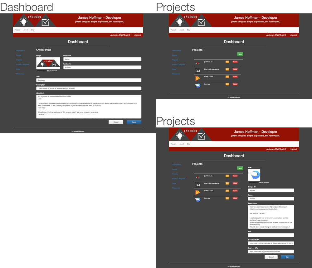
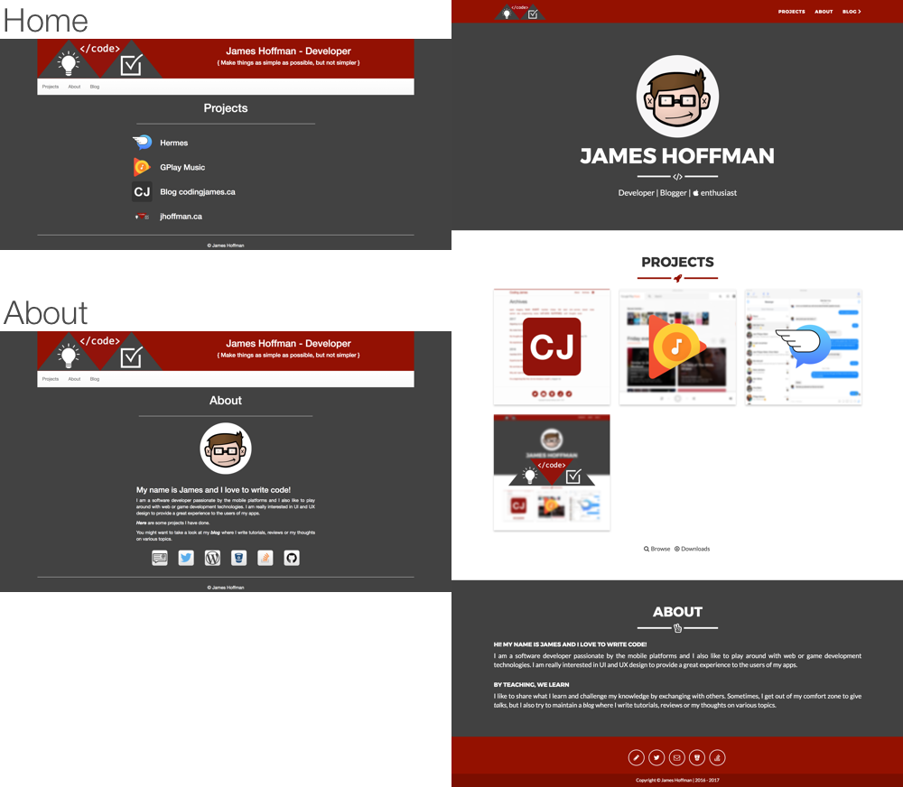
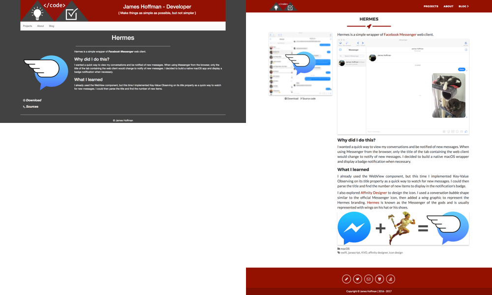
After a few days of work I completed my new website design. I organized my content and updated some images at the same time. Here are some screenshots of the site before and after the redesign.
Dashboard: My custom CMS dashboard to manage some branding elements and the projects displayed.

Home: The old site had 2 distinct pages for home and about, the new design unifies them on a single page.

Project details: The project details page is pretty similar, I added tags and categories to organize the projects in the new version.

Browse projects and downloads: Since I added tags and categories in the new design, I could display a complete listing of all my projects grouped by category. It’s also very easy to filter the projects with the Collections helper to display only the projects that have a binary to download.

Talks: Because Jigsaw’s config file is plain PHP, I added a custom config variable to create an array of the talks I did and easily share the slides without needing a specific layout for each item.

Conclusion
To sum up, I am very happy with the result. I discovered a nice tool and found an easier workflow to manage my content. I hope I will be able to reuse Jigsaw in another project because it’s a breeze to work with.
Any comments? Hit me up @codingjames